Thứ Bảy, 28 tháng 12, 2013

Review: iPhone 5s

Gizmag reviews Apple's iPhone 5s, the latest iterative 'S-series' update out of Cupertino

Apple has settled into a pattern. While most smartphone makers try to blow our minds once a year with eye-catching new designs, shapes, and sizes, Apple has stuck to its guns: a redesigned iPhone one year, an almost identical-looking iPhone with upgraded internals the next. Is the latest iterative update, the iPhone 5s, worth jumping on? Or is this the year to hold off, or maybe test the Android waters? Let Gizmag try to answer, as we put the new iPhone 5s through the paces.
We reviewed the silver model (it's also available in gold and 'space gray')
The iPhone 5s is very familiar-looking. If you were hoping for a radical redesign, or something that feels completely different from the iPhone 5, then you're going to be severely disappointed. The 5s' weight and dimensions are identical to its predecessor. And except for its home button, dual-LED flash, and slightly different colors (apparently the gold model is all the rage), it looks identical too. Yep, the 5s is an "s"-series iPhone through-and-through.
The 5s uses Apple's proprietary Lightning connector for charging and syncing
Fortunately for Apple, the iPhone 5's look and feel have made a lot of people very happy, so the 5s isn't likely to give many people fits either. Like its predecessor, it's made of anodized aluminum. It's very light (112 g), very thin (7.6 mm), and comfortable in just about any size of hand. It disappears in your pocket more than any high-end phone on the market.
The iPhone 5s isn't the biggest, flashiest, or even the most stunning smartphone around. You could even argue that the iPhone is starting to look pretty boring next to some of its competitors. But it's still a gorgeous, extremely well-built phone. It's hard to get too nit-picky with that.

Too small, or just right?

The iPhone 5s is a minor update, but it's hard to knock the overall level of quality
The screen is also unchanged from the iPhone 5. The 5s' screen quality is still excellent, and isn't cause for any concern. Though high-end Android phones have jumped into 1080p land during the last year, Apple is standing strong with its 326 pixels per inch Retina Display. And we don't have a problem with that. Everything is plenty sharp, colors are as accurate as ever, and the simpler visual design of iOS 7 really stands out on it.
There are much sharper smartphone displays out there, but there's little to complain about...
The iPhone's screen size, however, is another matter. Apple likes to fashion itself as a company that follows its own values above all else, not letting market trends or its competitors influence its decisions. It's admirable enough, and probably accurate, given the company's recent stay-the-course, come hell or high water attitude.
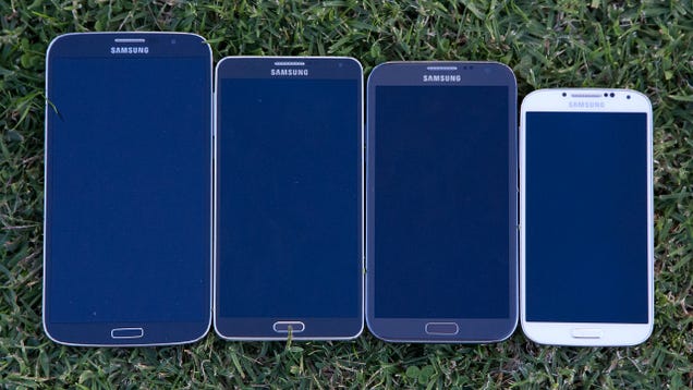
But screen size is one area where Apple has fallen behind. Way behind. It's not that there's anything terribly wrong with the iPhone 5s' four-inch display. We're sure that many customers with smaller hands appreciate having a smartphone that's both small and high-end. But the smartphone market has changed. Many customers have shown that they love bigger screens, andrivals like Samsung have been happy to capitalize on that shift in taste. Apple hasn't (yet) responded to that.
The iPhone's 4' screen looks very small next to the Galaxy S4's 5' display
The iPhone 5s' screen is very small for a 2013 smartphone. I'd go so far as to call it the phone's biggest deficiency. Now, of course, not everyone wants a huge smartphone or a phablet, and Apple's sales figures prove that. But for the many customers that do want a 5" screen, Apple doesn't seem too worried about you. Customers' tastes may have changed, but Apple is still sticking to its four-inch screen guns.
Is Apple showing remarkable steadiness in the face of pressure, or pig-headed stubbornness that gives its competitors an unnecessary opening? We'll leave that one up to you. But either way, we wouldn't be surprised to see a bigger screen on Apple's 2014 iPhone (likely the iPhone 6). At some point, that turning tide has to play a role.
One advantage of the smaller screen is that it's easier to reach across the screen with one finger than on, say, the Galaxy S4. It makes one-handed tap-typing a little easier too, though a Swype-like trace keyboard would have helped out even more (we're left scratching our heads as to why Apple hasn't added that yet).

That fingerprint sensor

Under the 5s' home button lives Apple's Touch ID fingerprint sensor
Touch ID is the iPhone 5s' fingerprint sensor, and it's also its killer feature. Living beneath the phone's sapphire home button is a biometric sensor that will learn your fingerprint(s), and let you use it to unlock your iPhone and authorize iTunes and App Store purchases.
Touch ID is classic Apple. It's a brilliant marriage of advanced technology and consumer-centric simplicity. Set a passcode for your phone, train your iPhone 5s to learn your fingerprint (it coaches you to hold your finger on the sensor multiple times), and you'll be able to unlock your phone with a short hold of that finger over the home button. You can train it to learn up to five fingers for yourself or trusted friends or family, and you can also edit and delete trusted prints. Anyone who isn't on the VIP finger list will be out of luck, as they'll need your passcode to get in.
When setting up Touch ID, the 5s prompts you to hold your finger on the home button in bri...
In our testing, Touch ID worked as advertised ... with a few exceptions. The big problem was after I went swimming. Touch ID doesn't respond to wet fingers, which wasn't a surprise at all. But if your fingers get dry and ashy after coming out of the water, it also won't work. A little lotion solved this problem (can't say that phrase has ever popped up in a Gizmag review), but it reminded us that there are times when the feature doesn't always "just work."
The rest of the time, though, Touch ID was the perfect balance of smartphone security and convenience. The cutting-edge technology fades into the background, resisting the temptation to show itself off. Touch ID gives you passcode security without the hassle of entering a passcode.
... just don't expect perfection. And if you're a swimmer, live in a dry climate (I tick both of those boxes), or are just partial to long baths, you might want to lower those expectations even further.

64 bits

The iPhone 5s is Apple's latest S-series update
The iPhone 5s is extremely fast. In Geekbench 3, it scored a 2,533 (the Galaxy S4 "only" scored 1,851). And the experience of using it matches those insane benchmark results. Everything is zippy, responsive, and immediate. Like a lot of recent high-end phones, there's no reason whatsoever to hesitate about its performance.
The biggest item of note here is Apple's shift to 64-bit architecture in the iPhone 5s' A7 system-on-a-chip. What does this mean for you right now? Probably very little, if anything. It gives Apple a weapon against the claims that it's no longer innovating, and it lays the groundwork for mobile computing that behaves a lot more like desktop computing. It means that iPhones and iPads with 4 GB of RAM could be coming down the road (theGalaxy Note 3 is already inching closer, with 3 GB).
But in regular, day-to-day use today? The iPhone 5s takes the speedy, nothing-to-worry about performance of the iPhone 5, and kicks it up yet another notch.

Camera

Apart from Touch ID, the 5s' other physical difference is its dual-LED flash
The iPhone 5s has an excellent camera, easily among the best you can find on a smartphone. In our testing, low-lit shots were improved over the iPhone 5, while well-lit shots looked as good as ever.
Flash photography got a boost with Apple's dual LED flash (branded as "True Tone"), though our testing didn't necessarily reveal any breakthroughs there. The biggest difference we can tell is that flash photos look more saturated than they would on other phones. This helps, and it's a welcome change. We just didn't find it to be an extremely significant upgrade.
What's that? Want some samples? Okay then ...
Here's a simple shot in direct sunlight:
Shot in direct outdoor lighting
Here's the same setting in crappy lighting, with the True Tone flash on:
The same setting, only with no artificial lighting and the 'True Tone' flash turned on
... and this is the same setting without the flash, under low artificial lighting:
Here's the blue orchid under low artificial lighting, with no flash
You can check out this review's image gallery for a few more samples.

iOS 7

The 5s sails through the new iOS 7
Despite its inconsistency, Touch ID is our favorite part of the iPhone 5s. But our second favorite part? That would be iOS 7, with its fresh coat of "flat design" paint.
User interfaces are always one of the most subjective parts of a smartphone experience, but we like the new look and feel of iOS. It's simpler, it's more to-the-point, and it does away with the frou-frou skeumorphism (heavy reliance on shadows, reflections, and real-world objects) from the iOSes of old. iOS 7 makes sense as a 2013 mobile operating system.
There are, of course, other non-cosmetic upgrades in the new edition of iOS. Command Center is a long overdue improvement, finally putting Apple's software on par with Android and jailbroken iPhones by giving it a quick-access settings menu. Improved multitasking (you now get live card-based previews) and AirDrop file sharing round out some of the highlights.

Battery life

Same speaker grilles, same headphone port, same Lightning port
If a smartphone has terrible battery life, no other feature is going to matter. But the iPhone 5s gives you nothing to worry about there. It showed us solid uptimes, in the same ballpark as – though slightly better than – the iPhone 5.
We ran a test where we streamed videos continuously, with Wi-Fi and Bluetooth on, and brightness at 75 percent. In this somewhat-scientific test, the 5s chugged along for six hours and 15 minutes before conking out. That's the best showing we've seen from a smartphone since we started doing that particular test (and no, we haven't put Motorola's battery beast of a smartphone, the Droid Maxx, through that test).
During more typical use, we don't think you'll have anything to be concerned about. The iPhone 5s' battery should easily last a full day with lighter to moderate use.

Wrap-up

The back of the iPhone 5s
We can see the iPhone 5s from two opposing points of view. On one hand, you could easily argue that it's the best overall smartphone out there. It's constructed like a piece of jewelry, it might be the fastest phone in stores right now, and the fingerprint sensor is a breakthrough feature. The 5s delivers a streamlined, rock-solid, fool-proof experience.
On the other hand, you could argue that the iPhone is now the most conservative kid on the block. There's nothing risky about the 5s, and there's nothing that departs much from Apple's successful formula. When you're as profitable as Apple is, "more of the same" is probably a good thing. But the 5s also feels like a very safe update. The most solid phone out there? Could be. But the most exciting phone out there? Not likely.
Hold your finger on the home button for a brief moment, and your iPhone 5s will unlock
Which side of that fence you fall on will probably be determined by where you're coming from. If you own an iPhone 5, there's little reason to upgrade. Sure, Touch ID is a handy feature, but really, are you going to plunk down for a new phone just to have better and easier security? The camera is better, but not by such a longshot that it's a selling feature. The 5s is faster, but the iPhone 5 is still plenty zippy for most uses.
If you're coming from an older iPhone (4S or before), then this is going to be a much bigger upgrade. You get a bigger screen, a lighter and thinner build, and upgrades in just about every other area. If you're still on one of those older phones and you're comfortable in the iOS ecosystem, then, by all means, get the 5s. You won't regret it.
The iPhone 5s' box art shows off iOS 7's redesign
If you're coming from a high-end Android phone with a large screen, then the 5s gets a lot harder to recommend. After spending time with a spacious (4.7" to 5") display, switching to the iPhone's four-incher isn't easy. Its screen looks pretty piddly next to its high-end Android competition. Those big screens aren't for everyone, but neither are smaller screens like the iPhone's. You'll need to figure out where your sweet spot is.
So the iPhone 5s is either the best phone on the block, or the most predictable. Or both. Maybe it's like a Rorschach test or a work of abstract art, and your opinion about it says as much about you as it does the phone itself.
Either way, the iPhone 5s is one of the easiest phones of 2013 to recommend. It might have the least wrong with it of any smartphone out there. It isn't revolutionary, but it is the best iPhone yet. And for many, many customers, that will be enough.

Thứ Ba, 1 tháng 10, 2013

Samsung Galaxy Note 3 Review: Biggerer and Betterer

Samsung's Galaxy Note series has been the most popular BIG phone since it was first released a couple of years ago. The Galaxy Note 2 made some major improvements over the original in terms of speed and utility, and while the Galaxy Mega was a giant step backwards, the Galaxy Note 3 looks to leapfrog them both. And, generally, it does.

What Is It?

It's a big honkin' phone that runs Android 4.3 with Samsung's TouchWiz skin over the top. It has a 5.7-inch 1080p Super AMOLED display that comes in at 386 pixels per inch. It also has a built-in stylus (oops, sorry, "S Pen"), for all your jotting and scribbling.

Who's It For?

Big-handed people who never learned QWERTY. People who do a lot of reading on their phones. People who like to doodle.
Samsung Galaxy Note 3 Review: Biggerer and Betterer

Design

Ohmygod. Samsung made a phone without a cheap plastic back! The back of the Note 3 is covered in leather. Or, at least it looks and feels like leather (enough to fool a lot of people). Up front is the big, lovely screen surrounded by a very minimal bezel. It retains Samsung's clickable home button and capacitive keys for Back and Menu. The S Pen tucks neatly into the bottom of the phone and remains unobtrusive until you pull it out. There is one (easily muffled) speaker at the bottom of the phone. There's a bit of a bump in the back for the 13MP camera.
Samsung Galaxy Note 3 Review: Biggerer and Betterer

Using It

In general, the Note 3 is plenty fast. Apps open reasonably quickly, but then run very without a hitch. Why only reasonably quick to open? The grumpy gatekeeper. Samsung's TouchWiz software is a heavy burden to carry, and even the mighty quad-core Snapdragon 800 processor clocked at 2.3GHz and a hulking 3GB of RAM stumbles from time to time, which is pretty crazy. It's fast, but frankly, it should be faster.
Samsung has also borrowed a couple of ideas from its competitors here. My Magazine is essentially HTC's BlinkFeed, but worse. It's an app that tries to lay out your life in a visually appealing way, breaking it into categories like News, Personal, Social, and "Here and now" (local stuff). It looks nice enough, but it's barely functional most of the time. This app crashed over and over, often freezing and crashing other, completely unrelated apps.
The other thing the Note 3 borrows are the Moto X's Touchless Controls. It allows you to wake up your phone and have it do stuff for you without even laying a finger on it. Instead of saying, "Okay Google Now," you say, "Hi Galaxy!" Then, instead of Google Now opening, you get Samsung's S Voice app. This is unfortunate. While S Voice can do virtually everything Google Now can do in theory, it just doesn't work as well. It's clunky, unreliable, and not as smart as Now.

Samsung Galaxy Note 3 Review: Biggerer and Betterer

The Best Part

S Pen software has gotten much, much better. For starters, its handwriting-to-type engine is greatly improved. It's still not as fast or as accurate as a good touchscreen keyboard, but if you really like scribbling, this is pretty great. It can pull off some slick maneuvers. For example, if you scribbled a bunch of contact info into a note and you want to dial the phone number, you just circle it, click "Link to action" and it'll put it in the dialer (or a person's contacts, or your text messaging app). It's the kind of utility that the Note series has always promised, but it's finally arrived. Even little things like erasing text is easier. It's legitimately good stuff.

Tragic Flaw

Audio quality is universally bad on this phone, which is a shame because despite being tablet-ish, it's still supposed to be able to make phone calls. Callers had constant issues understanding me and vice versa. Using T-Mobile's Wi-Fi calling helped a bit, but not enough. The external speaker is bad, too. Aside from sounding muddy and totally unbalanced, its position at the bottom of the phone makes it extremely easy to muffle.
Samsung Galaxy Note 3 Review: Biggerer and Betterer

This Is Weird…

The back of this phone feels fantastic! That is something we have never, ever said about a Samsung phone, but it's true. The leathery-finish looks good, doesn't pick up fingerprints, and provides a really nice amount of traction for your fingers. It won't easily slide off your leg, either. It feels nice and strong, too, and yes, it's still removable so you can get to the battery and SD card slot. We hope Samsung continues in this direction with the Galaxy S5, though we suspect this may just be a play for the attention of business-folk who seem to gravitate toward the Note (it's big and shiny).
Samsung Galaxy Note 3 Review: Biggerer and Betterer
(Left-to-right: Galaxy Mega, Galaxy Note 3, Galaxy Note 2, Galaxy S4)

Test Notes

  • Until we all have the same-sized hands, the debate about whether a phone is or isn't too big will never end. It's subjective. That said, to me this phone is too big. I have large hands, but I struggle to use the Note 3 one-handed, something that's a must for me. Your phone-handling preferences may vary.
  • The 3200mAh battery holds up admirably, but all those pixels take a toll. More often than not, I made it until about 8pm before I needed to reach for a charger. With heavier use it was shorter, and with lighter use I made it well into the night. It's unquestionably not as long-lasting as the Droid Maxx, but then again, not much is.
  • It's presently one of two devices that works with Samsung's Galaxy Gear smartwatch, and the only phone.
  • The 13MP camera is excellent, especially in sunlight. Photos and videos were sharp, had nice color, and decent depth-of-field. You can see some samples here.
Samsung Galaxy Note 3 Review: Biggerer and Betterer
  • TouchWiz has been refined somewhat in this implementation, but it still bogs down the phone. The Google Edition of the Galaxy S4 (which has stock Android instead of TouchWiz) instantly became one of our favorite ever phones. The presence of the S Pen makes us think we'll never see a Google edition of the Note 3, however.
  • Despite the fact that Samsung licenses software from SwiftKey (our favorite third-party keyboard) the built-in keyboard is way worse. Text predictions are all over the place and words get broken into fragments a lot.
  • The screen is really lovely, especially for viewing photos. It has those perfect blacks we love so much on AMOLED screens, and it's nice and sharp.

Should I Buy It?

Do you like really big phones? Then yes! This is the best big phone out there. Do you hate big phones? Then no, of course you shouldn't get it because you will drop it on the ground and cry. That's pretty much the long and short of it, at least for now. Oh, except for the price.
Depending on the carrier, this puppy will run you $300 to $350 on contract. That's pretty damn steep. But if you've got the coin, you like this size, and you can get over the software annoyances, this is probably the phone you want. Ignore the gravitational pull of the Galaxy Mega. Size aside, this is three times the phone that is.
We still long to see Samsung get it together on the software side. As it is, the software on the Note tends to get in its own way, which has long been a Samsung tradition. Less is more, Samsung, even on a phone this big. [Samsung]

Samsung Galaxy Note 3 Specs

• Network: Most major U.S. carriers
• OS: Android 4.3 with TouchWiz
• CPU: 2.3 GHz quad-core Snapdragon 800
• Screen: 5.7-inch 1920x1080 Super AMOLED (386 PPI)
• RAM: 3GB
• Storage: 32GB or 64GB plus micro SD up to 64GB
• Camera: 13MP rear ("UltraPixel")/ 2.MP front
• Battery: 3200 mAh Li-Ion
• Price: $300 - $350 (with a two-year contract, generally)

Thứ Sáu, 28 tháng 6, 2013

Understanding Model-View-Controller

Like everything else in software engineering, it seems, the concept of Model-View-Controller was originally invented by Smalltalk programmers.
More specifically, it was invented by one Smalltalk programmer, Trygve Reenskaug. Trygve maintains a page that explains the history of MVC in his own words. He arrives at these definitions in a paper he published on December 10th, 1979:
  1. Models
    Models represent knowledge. A model could be a single object (rather uninteresting), or it could be some structure of objects.
    There should be a one-to-one correspondence between the model and its parts on the one hand, and the represented world as perceived by the owner of the model on the other hand.
  2. Views
    A view is a (visual) representation of its model. It would ordinarily highlight certain attributes of the model and suppress others. It is thus acting as a presentation filter.
    A view is attached to its model (or model part) and gets the data necessary for the presentation from the model by asking questions. It may also update the model by sending appropriate messages. All these questions and messages have to be in the terminology of the model, the view will therefore have to know the semantics of the attributes of the model it represents.
  3. Controllers
    A controller is the link between a user and the system. It provides the user with input by arranging for relevant views to present themselves in appropriate places on the screen. It provides means for user output by presenting the user with menus or other means of giving commands and data. The controller receives such user output, translates it into the appropriate messages and pass these messages on to one or more of the views.
It may seem like we're deep in Architecture Astronaut territory now, but bear with me. The MVC concepts are a little abstract, it's true, but it's an incredibly common pattern. It is literally all around you. In fact, let me bring it back down to Earth this way: you're looking at MVC right now.
Model = HTMLView = CSSController = Browser
MVC: HTML = ModelMVC: CSS = ViewMVC: Browser = Controller
This ubiquitous trifecta represents MVC almost perfectly.
  1. Model
    The HTML is the "skeleton" of bedrock content. Text that communicates information to the reader.
  2. View
    The CSS adds visual style to the content. It is the "skin" that we use to flesh out our skeleton and give it a particular look. We can swap in different skins via CSS without altering the original content in any way. They are relatively, but not completely, independent.
  3. Controller
    The browser is responsible for combining and rendering the CSS and HTML into a set of final, manipulatible pixels on the screen. It gathers input from the user and marshals it to any JavaScript code necessary for the page to function. But here, too, we have flexibility: we can plug in a different brower and get comparable results. Some browsers might render it faster, or with more fidelity, or with more bells and whistles.
So if you believe the web has been at all successful -- most signs I've seen point to yes -- then you also have to acknowledge the incredible power of Model-View-Controller.
It's no coincidence that many of the most popular web programming frameworks alsoencapsulate MVC principles: Django, Ruby on Rails, CakePHP, Struts, and so forth. It's also officially creeping into ASP.NET under the fledgling ASP.NET MVC project.
Just take a gander at the project layout in a sample ASP.NET MVC project:
ASP.NET MVC project organization
It's almost self-explanatory, if you've ever built an application of any kind:
  1. Model
    The classes which are used to store and manipulate state, typically in a database of some kind.
  2. View
    The user interface bits (in this case, HTML) necessary to render the model to the user.
  3. Controller
    The brains of the application. The controller decides what the user's input was, how the model needs to change as a result of that input, and which resulting view should be used.
It's beautiful in its simplicity, as Terence Parr notes:
For the "MVC" of a web app, I make a direct analogy with the Smalltalk notion of MVC. The model is any of the logic or the database or any of the data itself. The view is simply how you lay the data out, how it is displayed. If you want a subset of some data, for example, my opinion is that is a responsibility of the model. The model knows how to make a subset. You should not be asking your graphics designer to filter a list according to age or some other criteria.
The controller in a web app is a bit more complicated, because it has two parts. The first part is the web server (such as a servlet container) that maps incoming HTTP URL requests to a particular handler for that request. The second part is those handlers themselves, which are in fact often called "controllers." So the C in a web app MVC includes both the web server "overlord" that routes requests to handlers and the logic of those handlers themselves, which pull the data from the database and push it into the template. This controller also receives HTTP POST requests and processes these, sometimes updating the database.
I look at a website as nothing but a graph with edges with POSTs and GETs that routes pages.
Here's one quick way to test if your application has properly segregated itself between the Model, View, and Controller roles: is your app skinnable?
My experience is that designers don't understand loops or any kind of state. They do understand templates with holes in them. Everybody understands mail merge. And if you say, "Apply the bold template to this hole," they kind of get that, too. So separating model and view addresses this very important practical problem of how to have designers work with coders.
The other problem is there is no way to do multiple site skins properly if you don't have proper separation of concerns. If you are doing code generation or sites with different skins on them, there is no way to properly make a new skin by simply copying and pasting the old skin and changing it. If you have the view and the logic together, when you make a copy of the view you copy the logic as well. That breaks one of our primary rules as developers: have only one place to change anything.
Skinnability cuts to the very heart of the MVC pattern. If your app isn't "skinnable", that means you've probably gotten your model's chocolate in your view's peanut butter, quite by accident. You should refactor your code so that only the controller is responsible for poking the model data through the relatively static templates represented by the view.
The power and simplicity of properly implemented MVC is undeniable. But the first step to harnessing MVC is to understand why it works, both on the web, and also within your own applications.